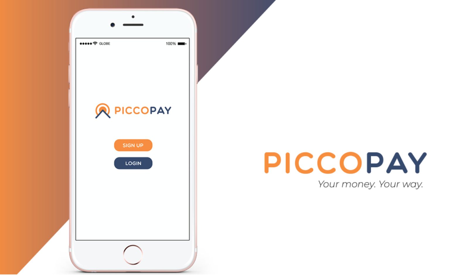
Startup Logo for Piccopay Case Study
- Lui Austria
- April 12, 2023
- 9:34 am
- No Comments
When creating a startup logo, it’s important to consider the company’s values, mission, and target audience. The logo should be simple, yet memorable and eye-catching. It should also be versatile enough to be used across various platforms such as websites, social media, business cards, etc.
Color plays a significant role in logo design as well. Different colors can evoke different emotions and feelings. For example, blue can convey trust and professionalism while yellow can convey warmth and friendliness. Choosing the right color palette for a startup logo can help set the tone for the entire brand.
Sharing to you a case study and brand journey of one of our clients, Piccopay.
Background
From an e-wallet to a payment gateway. Piccopay started as a digital wallet offering a convenient and secured e-wallet to the unbankables, turned into a payment gateway to Filipino MSMEs, for a pandemic-proof business with exceptional customer payment experiences.
The Challenge
Back in 2017, Obra Digital was challenged by the client to build a brand visual design and marketing collaterals as an e-wallet providing safe and convenient financial access to the unbankables – tindera sa palengke, security guard, tindahan from provinces, even fro takatak vendors.
Our Obra

Conclusion
In conclusion, a startup logo is a vital aspect of branding and should be carefully designed to accurately represent the company and appeal to its intended audience. It’s worth investing the time and effort to create an effective logo that sets the foundation for a successful brand.
Want more? Read more case studies here.
Need to boost your brand or business this year? Book a meeting with us today!
Share

